Design Process
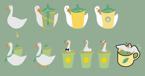
The logo design process explored two main directions: one combining a duckling with a paper cup, and the other merging a duck’s form into a teapot.
Each direction suggested a different brand positioning—either a modern dine-in teahouse with Chinese influences or a casual take-out concept. Given the brand’s minimal and playful illustration style, which appeals to a younger demographic, the take-out model was chosen as the final direction.
Early concepts for the logo and cup design featured a light green and yellow color scheme. However, user feedback suggested the palette felt overly feminine. Since the brand’s goal was to create a relaxing space for everyone, the colors were revised to a deeper green to better appeal to a broader audience. The packaging design was also simplified, and cap colors were used to indicate size and flavor variations.
To establish a cohesive brand identity, all product visuals share a unified green palette and duckling-themed illustrations. Patterns on cups and tea
packaging follow geometric structures, while the logo on the cup takes on a playful twist—it uses negative space to suggest a duckling sipping tea, turning the brand into a visual pun.


Academic Project
Ducky Tea
Date
October 2020
Project type
Branding Design - Academic Project
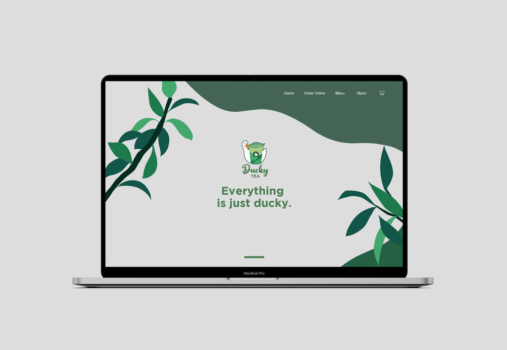
Ducky Tea is a lighthearted branding project for a fictional tea shop. The name plays on “duckling” and the idea of something charming and delightful. Using a soft green palette and clean illustrations, the design aims to feel calm, friendly, and welcoming to all. Beyond the visuals, this project explores how tone and accessibility can shape brand experience — a theme I continue to explore in user-centered design.